For this brief we were given a range of museums that has a collection of surprising visual artifacts. We were to then help communicate the museum and the collection to the public, this could be created in any forms of media. With choosing the London Film Museum out of a hat, I was instantly excited about exploring more into the museum itself as well as the creative exhibitions that it holds for the public view.
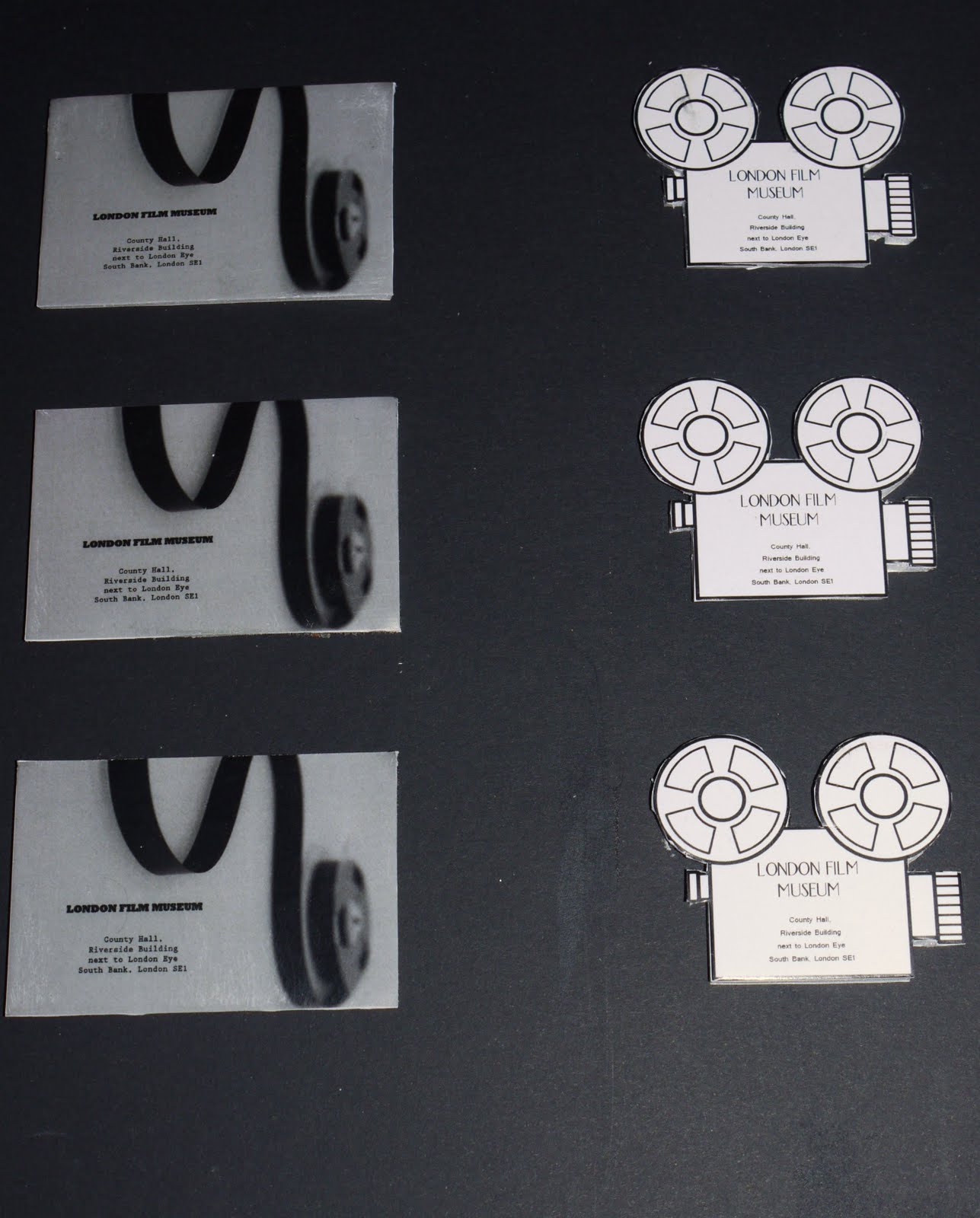
I decided to create some business cards for the Museum to help it advertise and remind people in a little way of the Museum and where it is. For one of the types of business cards I used a simple photograph that I took of a film reel, this creates the effect of the museum being near the River Thames from the flow of the film. Another design I used was a simple outline of a film camera which helps to symbolise film itself.


I decided to create a poster to help advertise the Museum by creating this I used a photograph I took just like the one I used on the business cards. To add an effect I added it to a current film magazine to see whether it could attract to the public eye. Within the poster design I decided to create the information about the exhibition in a solid block of text at the bottom, I decided to create it this way as it shows the effect of a film poster.


To go with the current work I decided I needed to branch out to attract the public, to do this I designed a direct mail for the public to receive through the post, that would advertise the museum as well as its exhibition. When exploring film I came up with the design of having a film reel that the public could interact with and explore it to find out the information. To add the information to the film reel I used Letraset transfer lettering that helped me create a print on effect on to the film itself. After creating the film reel I decided that for the packaging, I would use an obvious object that the public would associate with film; the clapper board.


Overall I am so pleased with the final outcomes as they were how designed and imagined them to be.
