Thursday 3 May 2012

Annual Report

For a university project we were given a brief to create an Annual Report for a topic that each of us were given by the tutor. I got Ceramics Society as my topic. 

After many ideas and sketches I decided I wanted to create a report that was beautiful outside and inside was rough and ready showing the makings of in a ceramic studio. I decided to create a look like this because I wanted it to portray to the goings on in a ceramic studio, rough and untidy inside making and then formed into a beautiful final product. To help show the studio I went and took my own photographs and used them for each page with a low opacity.

I loved looking at the blue and white patterns that are featured on delftware and other ceramics so I decided to try something different and create the Annual Report in a circle shape and actually have the cover look like a plate.

Images of the outside.


Inside Pages


Photography : Art Directio

For one project in this module I had to visit Wolverhampton Racecourse to take photographs of things going on. These photographs had to then be put into a magazine form. We were asked to create our own title, which I chose 'Finish Line'. Each page could feature our own images in anyway whether it be full bleed or even black and white. The body copy in the magazine is place holder text and the headings were our own to create.


Each page creates a sense of wanting to look all around the page. Each page has a different quality due to the type of photograph filter used.


Thursday 29 March 2012

Staring Into Shadows

A budding new author asked me to design and create a book cover for his first novel. The novel is to be published as a Kindle book on the amazon website covering the UK, America and around Europe. 

The book is called Staring into Shadows, it is an anthology of short fiction, exploring the dark nature of men and women when presented with impossible decisions. The cover has been hand drawn by myself and then been focused on photoshop.


The book is now ready to buy and I would fully recommend it as a very good read


YCN Student Awards - Graze

Team project by Samantha Footman & Katy Brockley

We decided to chose the Graze brief on YCN Student Awards as we thought we could create something 
different with it and bring it to life. We decided to play around with the idea of ‘Hand Picked’. We chose hand picked as most of the food delivered by Graze is hand picked, we decided to illustrate this factor which would show the stages in creating the box. From it being grown, picked, fresh products, filling the box and the box being complete. 

Each front of the boxes feature the brand new illustrated logo, area for the address and then a logo/symbol that states which kind of box it is being sent to you; for example nibble box has a leaf with ‘Nibble Box’ stated below it. This helps distinct each box from each other.

When you open the box you are faced with illustrative typography stating ‘Nature Delivered’ this is situated where it is so it catches your eye as you open the box and helps the receiver get more excited in what to find.


We decided to feature an illustration on the inside of the box which is one of the stages that Graze uses to create the box. It is just a simple line illustration of a strawberry being hand picked with fun typography at the bottom of it. This creates a fun and different approach from what Graze has today, which is a photograph of fruit/vegetables.

The logo has also been added within the crease of the box. The logo relates to nature and it looks like its growing and has been hand illustrated to create the same fun effect as the other images we are using. 


Direct Mail
For the direct mail we decided to keep with the ‘Hand Picked’ theme and create a direct mail which is fun and different. We designed the direct mail for the receiver to have to work with it, the receiver has to open it up to read further on. To create a sense of ‘Hand Picked’ we were brainstorming which fruit we could use to portray and we came up with an apple. To help us decide with an ‘Apple’ was that many people when thinking of healthy and hand picked think of an apple.

On the front of the apple a sticker is situated on it, this sticker actually has the code for a free Graze box for the receiver to try. We decided to use the concept of a sticker for it to look like a apple sticker and to help it look realistic.


As the recipient opens the concertina fold of the direct mail they will find an illustrated view of the stages of what happens at Graze to create the box. Each one has an image and type explaining and showing what happens. The last page shows the logo and also explains what to do with the sticker on the front.


We thought as it is a concertina fold, the back would need an image so it’s not a plain background, to find a result we created an image that was an illustrated view of the inside of an apple.


Here is a digital copy of the designs of the final outcomes from above.

outside of the box


inside of the box


logo

                
sticker


nature delivered logo

 
symbols that feature on the boxes


direct mail


TRAPPED

Group Project - Annie Jean Crooks, Charlotte Alcock, Katy Brockley and Samantha Footman

For a group project we were faced with a brief to communicate the word 'TRAPPED' in some form of hand crafted typography. We decided to create the word using MDF and cut it out, we then photographed it in a natured area.


Walsall -The Leather Goods Town

For a project at uni we were to explore a place and create something that communicates that certain place in any form of media/design. This project would be our 'Sense of Place'.

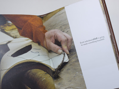
For my 'Sense of Place', I decided to use the town from which I come from; Walsall. Walsall has a lot of history in the Leather business and still has today. Not a lot of people are aware of this and I decided my challenge was to put Leather back on the map for Walsall. I was able to visit a current Saddle factory that are situated in my hometown and talk to people who work in the industry and really see the industry part of their lives. Many have been working there since they were little which helped me find out how the industry has changed and what got them into the game.

With all the information i got from talking to the workers I also took photographs of them working and the different areas in which help make a Leather Saddle. After gathering all the images taken and the information I decided to create a book. The book would show the stages of creating a Saddle and with comments from the workers.

front


back

The final outcome of the book was planned to look like part of a Saddle and going to the factory with a design in mind they created it for me out of Leather there and then which helped it look very professional and has gave it a perfect finish. I'm really happy with the final outcome and hope to see this book go further in putting Leather back on the map for Walsall.